Typography is considered a crucial element in design: it not only generates a visual impact on the reader, but also arouses interest in the message that the brand wants to convey. The title has a similar function with respect to content, as it hooks the reader and makes them want to know more.
If you want your publications to attract the reader’s attention, it is important that you take advantage of both tools and choose the font you are going to use in the titles. In this article, we bring you some ideas for attractive fonts that you can apply in titles.
How to choose letters for titles?
To choose the right typeface, you should look at aspects that go far beyond aesthetics. A font can reinforce the message you want to convey or be the only element that constitutes it. Here are some practical tips for you to find your ideal lyrics:
- The font must beIf it’s complicated to read, the user simply won’t open the article. In addition, a lack of clarity can lead to unconscious doubts about the reliability of your business.
- It’s a good idea that your title typography reflects your brand image. This will help strengthen your positioning. For example, if you have a law firm, avoid flashy typography and opt for something more neutral.
- The title shouldstand out within the text. You can do this by playing with the layout and font size.
Also reflect on the user experience when interacting with your text:
- The needs of your audience.Think about the audience you’re targeting. The designs for children and adults are not going to be the same.
- The theme of the text.The font can also vary according to the theme or type of text. The headline of a newscast requires a sober and neutral handwriting. If you’re designing a music festival promotional poster, look for eye-catching and fun lyrics.
- The device from which the content will be viewed. Consider whether the title will be read from your cell phone or from a poster displayed on a building.
Font families
Typefaces are divided into groups or families. Every family shares certain characteristics. Knowing these differences will help you narrow down your search: you can narrow it down to the family that corresponds to your goals.
The traditional classification is the one proposed by Maximilien Vox in the early 50s. Later the Vox-ATypI classification was adopted by the International Typographic Association (ATypI). Consider the thickness of the stroke, the axis of the inclination and the height, among other details.
According to these criteria, typefaces are divided into 11 families: humanistic, garaldas, real, didonas, mechanical, linear, incised, writing, manual, Frakturs (fonts inspired by medieval or Gothic writing) and non-Latin (typefaces in non-Latin characters).
The most popular ranking in web design
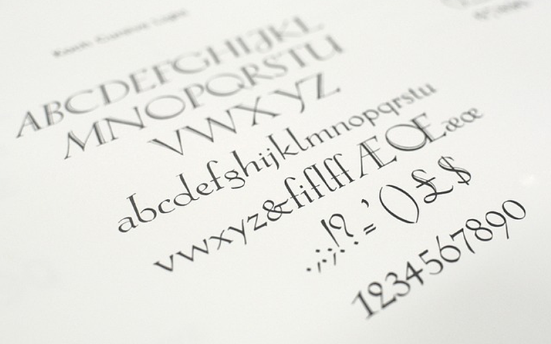
- Serif: This style of fonts began to be used around the fifteenth century. Its name is due to the thin strokes that are located at the ends of the letters. These strokes are known as serifs, graces, finials, or terminals. They are perfect for titles, where you seek to express elegance, sobriety and style.
Computers have the lowest resolution than paper. So thin strokes will make your website title difficult to read. However, serif fonts are perfect for use in printed materials.
- Sans serif: As the name implies, this typeface family lacks serifs. Its straight strokes give a sense of modernity. It is quite versatile, practical, and easy to understand which is why several brands use it in their logos, for example, Google, Fedex, Uber, Chanel, Netflix, Calvin Klein, and more.
- Serif slab: This group has serifs, but the thickness of the letter is uniform, with thick strokes. Although it is associated with western style and western movies, you can also see it in the logos of brands such as Volvo, Sony and Honda-
- Script:This family includes fonts that mimic handwriting, calligraphy, and cursive. They are inspired by historical practice, when most headlines, logos, and signs were created manually. Script fonts may look less professional, so use them carefully for less formal purposes, such as in end-customer promotional materials.
- Decorative:The main feature of this group is the unconventional shapes and proportions of the letters that are designed to generate a dramatic impact on the user. Decorative fonts look best in creative text titles and unique design materials.
Let’s look at some examples of fonts for titles
Aventi. Due to the curvature of its letters, this decorative typeface gives an almost hypnotic sense of fluidity. It would look great on a brand’s website with an innovative vision and futuristic aesthetic.
NT Valentino: This Serif font has a classic feel and reflects timeless elegance. It would be an ideal choice for a restaurant, a fashion brand or perfumery.
Visage Demolished: It gives a sense of the passage of time. This makes it perfect for brands that want to give a vintage touch to their titles or for post-apocalyptic video games.
Akira: If you have a business related to technology, vegetarian foods, sports services or some type of product that reflects modernity and experience, use this sans serif letter to promote it.
Azonix: It is a sober font while remaining imposing and eye-catching. In addition, it is so versatile that it can be used by anything from a technology company to an alternative clothing brand.
Silvano Western: As a worthy representative of the Slab serif family, it has the typical serifs, thick and constant strokes. This typeface is perfect for contexts that evoke the aesthetics of the Wild West and search signs.
Universal Serif: Universal Studios’ typeface, another canonical example of Slab serif, is a strong, dominant font that’s easy to read from any distance.
Caviar Dreams: If your brand speaks to a young audience or you’re in the event industry, consider this versatile and fun font.
Calinastiya: If you want your baking brand to have a legible, modern cursive typeface full of personality, opt for Calinastiya.
The most important thing
- … is to choose a suitable source. A well-used lyric makes titles more engaging, and the user experience more enjoyable.
- … it is to remember that there are different typographic families. Choose one that best conveys your brand’s personality.
If you enjoy designing titles and other intuitive elements that facilitate user interaction with content, you should consider learning more about UX/UI design.