As a designer, you know how important it is to create logos for your clients that stand out from the crowd. There are several design factors that influence the success of a logo: color palette, typography and shape, to name a few. However, one of the most challenging is knowing how to combine fonts that harmonize and add richness to the design.
Unfortunately, many designers have problems choosing font pairs for a logo design. There are many beautiful fonts to choose from, but the trick is to find the right ones that complement each other perfectly—whether it’s for a logo with a built-in subline or even within the same logo.
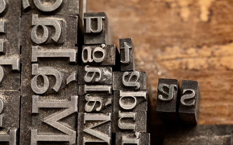
Just because two fonts look good on their own doesn’t mean they belong together. Some scriptures are intended for marriage, while others should not even go on a first date. Luckily, there are a few rules you can use to determine which fonts go well together! Here are a few important tips.
Important tips for combining fonts
1. Try combining two fonts from the same font family
Use this proven method to quickly and reliably find fonts that work with each other.
Font families (serifs, sans serifs, slab serifs, italics, etc.) were created to systematize fonts that complement each other. Like all families, the scriptures have “genetic” similarities; however, unlike their human counterparts, they are designed to get along well with each other! To find the ones that are suitable for your logo. Choose a font family with multiple styles, weights, lowercase and uppercase letters. Because they’re designed to work together from the start, this approach can save you the hard work of matching two unrelated fonts.
2. Combine a traditional font with a decorative font
If you can’t find a family that gets along well, then you should go a little further and combine a distinctive, distinctive, decorative font with a more traditional, more neutral one. This approach is very effective, and can give your client’s logo a distinctive look on its own. You can achieve this by assigning a specific role to each font. For example, by using a decorative font for the name or brand – which gives the logo a playful, light appearance – and a traditional font for the tag or subline, or vice versa.
The goal is to create a strong visual impression but at the same time to ensure cohesion so that the two fonts used look good.
A little tip: Decorative fonts tend to work better in shorter lettering.
3. Be careful when mixing moods
Font families have different “moods”. The key to designing a successful logo is to combine fonts that fit together naturally and are aligned with a company’s market. When it comes to logo design, you can tell if the fonts’ moods fit together by simply bringing them together; This is done quite intuitively. Even though the fonts chosen may be different, they should convey the same message. For example, if your client offers a professional service. Then a bubble font would undermine their seriousness while putting a children’s birthday party planner’s brand in a cheerful light.
4. Create contrast with font weights
Some of the world’s most recognizable logos are word marks, which consist only of the name of the company. However, many designers have added different styles and feel to their logos using contrasting font weights. This font weight means how thin or thick the line of a font is.
In a logo, you can either play with the degree of boldness of a single word or character compared to the neighboring one. Or use a bolder font for the entire lettering and a finer one for the tag or subline. As with all logo designs, it’s all about balance. And when you have found it, you notice it, simply because it looks ‘right’.
5. Combine tight kerning with wider kerning
For those who don’t know, the kerning of a font is the distance between the individual characters. Using fonts with different kerning is a strong differentiator because it shows viewers that they see different elements of the logo. Try to use a tighter kerning for the brand name itself, and a more airy kerning for the subline.
But that doesn’t mean that you should scatter the letters of the slogan all over the page; on the contrary, viewers will lose interest if you “gut” the typography, because they will have problems deciphering a simple tagline. Also, the letters of the logo lettering should not be placed too tightly, otherwise it will be difficult to read the brand name at all. So play with font pairings that vary the spacing to make the overall look more balanced.
6. Combine a serif font with a sans serif
The difference between these two font families is that serif fonts such as Times New Roman have decorative “feet” (embellishments) at the ends of most lines, while sans serif fonts such as Arial do not have these lines.
So why do these two font types work so well together in logo design?
The reason: they form a great creative contrast and still complement each other. What’s more, both serifs and sans serifs are generally very legible and give the viewer a professional, classy impression. However, if you go down this route. You need to make sure that the serifs and sans serifs you choose have different weights and styles so that they don’t look too similar and work against each other.
7. Make sure both fonts are easy to read
The fonts you combine must be easy to read wherever they are used.
Once you’ve chosen your fonts and added them to your logo design, just zoom in and out to see how well they scale. Then think about where the customer will use their logo. It has to be just as readable on a social media avatar as it is on the header of a website, mobile device or business card.
If the logo loses clarity when scaling, don’t worry. Because it may only be necessary to increase or decrease the size or stroke width of the font to solve the problem.
Conclusion
Combining fonts for your client’s logo doesn’t have to be difficult, but it does take a bit of work. Remember to focus on pairings that contrast in some way—whether it’s from the font families themselves, like serifs and sans serifs, or because of the boldness of the characters. Choose two fonts with complementary moods so that the viewer sees the design as a whole rather than as separate elements. Then all you have to do is follow the rules for selecting fonts from the respective font families, for mixing and adapting, for mood and contrasting. And above all: Always remember: Keep it simple. Good luck!