The color palette of a website, social media profile, or any platform used for branding is extremely important. Colors not only have their own personality, but also generate numerous emotions in the receivers of the message. Therefore, it is very important to choose with great care the shades that will make up the color palette of any digital project.
In this article we tell you what a color palette is and its importance, how to build one, as well as some examples of planet generators that are very easy to use
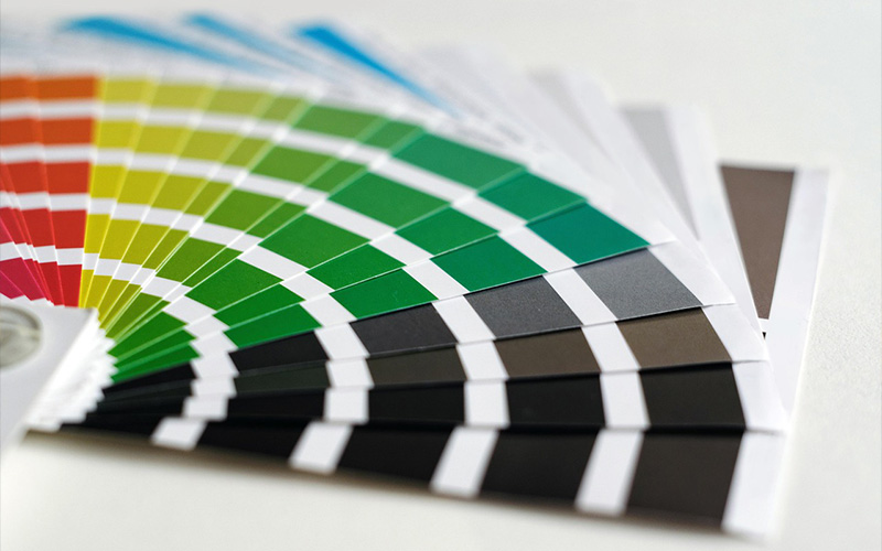
Discover the importance of colors and how to use them for your projects.
What is a color palette in graphic design?
The color palette is the set of shades that are chosen for a graphic design. Logos, banners, promotions, illustrations, and other designs are usually governed by a color palette pre-set by the creative or designer.
Being clear about the colors, shades and intensities that will be used in your design is essential. It will depend on whether the target audience to which it is aimed identifies your seal or recognizes the brand, and manages to connect with the message you want to convey.
What is a color palette for?
The confidence and security offered by the blue of platforms such as Facebook or LinkedIn, the elegance and power that black brings from brands such as Apple or Nike or the fun and energy that emanates from the yellow color that identifies brands such as Chupa Chups.
And so we could list hundreds of brands or companies that have their color palette very well identified. They understand their importance for users to identify them in any context and to awaken emotions that contribute to the project.
There are multiple benefits to using the right color palette based on the design and goals of the creator.
Colors influence the aesthetics of the image and its ease of understanding, even the ability they have to transmit emotions and achieve goals.
Below, we show you some of the advantages of using a color palette suitable for our design.
Identification
The combination of colors used in an advertisement, image or design serves to identify who is behind it. They are an intrinsic part of a brand’s identity, so it is essential that their choice is made consciously.
Convey emotions
As we showed you above, colors convey a series of emotions and sensations that you can use to your advantage to convey the desired message. Make sure you know what the particularities of each shade are and their meaning when combining them or using them alone so that you communicate appropriately.
Harmony
There are many benefits of the color palette to mold the subjectivity of the user and make them connect with the design. However, it is important not to forget the most superficial aspect, the one that generates that unforgettable first impression.
Therefore, it is important to choose your own blend with personality, but in which the elements harmonize with each other. Otherwise, you’ll only get your audience to get a sore eye as soon as they see the design.
How to create a color palette for a brand?
There are numerous combinations of colors, shades and intensities, as well as archetypes of color palette, because the possibilities are endless. However, below, we tell you the details about the 3 most used palette archetypes in graphic design.
Find out how to choose the color palette that matches the right way.
Monochromatic color palette
A monochromatic palette includes all the shades of a color. It is formed from the derivatives of a single color in which shades, shadows and tones are taken into account.
To obtain the range of shades, black and white is added to the main color in order to obtain at least a combination of three colors.
These types of palettes are the easiest to create, especially if it’s a minimalist design. They offer a sense of harmony and unity and, because they are so simple, they allow the user to easily and quickly identify the brand or seal of the creators.
Complementary color palette
These palettes are formed with the colors that are in opposite positions to the color wheel.
The powerful contrast of the shades catches the eye, but it’s not the best option if you’re also going to include text. This combination makes it difficult to read, unless you use the right contrasts of tones between the letter and the design.
Analogous color palette
This palette is characterized by the combination of adjacent colors on the color wheel. Those who are close to each other.
Again, this combination of complementary colors allows the brand to be easily identified and conveys a lot of serenity.
They are very versatile when it comes to reflecting the identity of the brand in different formats, but you must make sure to use them in the right way according to the type of design and support.
What is a color palette generator?
Want to create a color palette? Well, you can do it automatically in a matter of seconds with programs designed for it.
Below, we show you the 5 best palette generators to combine colors online.
1. Adobe Kuler Color Palette (Currently Adobe Color)
Adobe Color is one of the most popular applications among graphic designers and visual arts professionals, in general. It is very easy to use and offers multiple options to customize your palette and thus create original combinations.
2. Hexa Color
It’s never been so fun to build a color palette. This program is known as the encyclopedia of color, as it offers a large repertoire of information about each shade and its combinations.
3. Color Hunter
If you have loved the combination of nuances used in a photograph or design, you are probably wondering, how to get the color palette out of an image?
Color Hunter allows you to upload the file from your computer to analyze the image and extract 5 of the colors that make it up.
4. ColourLovers
It is a community made up of more than 9 million users in which designers share their own palettes and designs that serve as inspiration. It also allows you to create a palette from scratch from 5 colors and their shades.
5. Plain color
If you love plastic arts and are inspired by the most recognized works throughout history, you will find in Color Lisa a great ally to create color palettes.
The application extracts the colors and nuances of the most important works of the most recognized artists.
Conclusion
And this is all we can tell you about the color palette, its function and the importance it has in any design.
Make sure you choose the right color combination so that the brand’s visual identity is harmonious, understandable, easily identifiable and conveys the emotions you want.
Now that you know what a color palette is, tell us how important this element is in your work as a creative?