f you are in the middle of the creative process of your logo, you should start at the base of it. Choosing the perfect font can become one of the most important steps, as it will help you develop the idea more easily. In today’s article we show you some of the best fonts for logos.
Finding inspiration can often be tricky, whether you’re experienced in logo making or inexperienced with the subject. The solution to this is to find the style you want to give it, and the message you want to convey. Fortunately, we have a wide range of sources, which will undoubtedly be very useful to you.
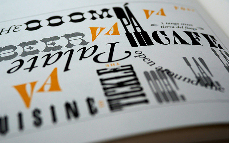
Here are some of the best fonts for logos:
Morganite
Its stylized shape will give your logo a special, and undoubtedly very characteristic, effect. Morganite is a popular free font that comes in 18 different styles, and is therefore ideal for logos, packaging, and labels.
Logo design sometimes requires easy-to-read fonts, but that doesn’t mean you should limit yourself to using an old, boring, or very simple font. On the contrary, you can innovate and dare with styles like this typeface, and which, despite being very legible, has a superb touch.
Teko
With a clear and legible design, it is the ideal typeface for a company that needs a strong statement. It’s a very simple and easy-to-read sans serif font, which makes it ideal for a logo, and you can apply it in any context.
Among its main and most attractive features are the tall rectangular shape and narrow recesses. This is one of the reasons why you can apply it in a casual way and it will look good in many styles.
Ailerons
This is a versatile font that provides a sense of regularity and readability. It has the same 8 densities, and you can use it in italics or also in the normal version. While it may seem like a very simple font, it is precisely this simplicity that allows for a dynamic play of font sizes with colors without the ad being too busy.
This font is inspired by the aviation industry, is edgy and perfect for giving your logo a clean and stylish look.
Iconic
Download this beautiful minimalist rounded sans serif font. According to the creators, Iconic is reminiscent of modern technology. If your business focuses on technology or digital media, this would be perfect for your logo.
This font also offers you something that very few typefaces have, and this is pictograms. If the style matches what your company is looking for, don’t hesitate to use these amazing elements. Its readability also makes it ideal for writing advertising texts, both short and long.
Modeka
With the help of this font you will undoubtedly get an elegant, legible, light and versatile logo, which also has a necessary modern touch. Its grace is found in its corners that are rounded and have very attractive finishes.
It is highly valued in the field of marketing, especially when it comes to developing advertising slogans. But we can also say that it is suitable for creating logos, as it is somewhat more original than those that are usually used, giving you a style that makes a difference.
Futura Font
Futura belongs to the Sans Serif family and is associated with efficiency and functionality. Volkswagen and Vuitton are the brands that have chosen it, and its success is undeniable.
This is one of those logo fonts that always looks young and fresh, even though it was designed in the year 1927 by artist Paul Renner. Perhaps one of the reasons why it is so popular among designers and typographers is this.
Nordic
This font is ideal for those looking for a unique logo. Its latest version offers two styles, which are alternative and regular.
It is inspired by the Norse runes, these are written characters used by the ancient Scandinavians. Nordic is an experimental logo font based on capital letters, numbers, and basic punctuation.
Proxima Nova
Stylistically, Proxima Nova is inspired by fonts such as Futura and Akzidenz Grotesk. The result is a hybrid that combines humanistic proportions with a somewhat geometric appearance.
Proxima Nova is a geometric font of great versatility which was designed by Mark Simonson, using typography styles from the 70s as a source of inspiration. It manages to combine proportions with a modern touch which gives it a clean appearance and plays with geometric patterns.
The Proxima Nova family is a complete reworking of Proxima Sans. These are 48 OpenType fonts that come in three widths: Proxima Nova, Proxima Nova Condensed, and Proxima Nova Extra Condensed.
Chivo
We continue our list with another free font that you can make the most of for your logo. You can download this from the Google platform. This is another sans-serif font, which seems close and consistent.
This two-variable typeface was published for the first time in 2011 by Omnibus Type, being the right one for small logos but with a strong message without losing class and elegance.
One of the reasons why you can apply it in your logos is that bold touch that is especially suitable for short names. The Chivo font comes in 8 pesos so you can perfectly adapt it to the needs of your logo.
Rubik
This potential logo font features slightly rounded corners that will fit nicely in any project. The font family has 5 different styles, which is why it’s another great logo font that looks great in capital letters.
In the case of Rubik, we are talking about a very flexible typeface, with more than 10 different weight options. It is a sans serif font developed by Hubert & Fisher for Google’s Chrome Cube Lab project.
Montserrat
This typeface began as a Kickstarter project in 2011, and its typeface is inspired by the signs and posters of the Montserrat neighborhood in Buenos Aires, a city in Argentina, specifically posters and canopies dating back to the twentieth century. We are talking about a sans-serif font, developed by Julieta Ulanovskaya, a graphic designer of Argentine origin.
It is characterized by a remarkable height of the x, shortened descending antlers and openings of considerable width. These features make the typography very legible, even when used in small sizes, it is ideal to be used in logos.
Thanks to the cooperation of its patrons, the typeface was able to see the light of day, which subsequently contributed to its popularity among designers. This is a very complete typographic family, as it has 18 different styles and weights.
Kolikö
Latin and Cyrillic characters in a striking regular, light, bold style are key pieces of this font. We are talking about a fresh sans-serif geometric style typeface with a clean structure, suitable for headings that try to offer an idea of innovation and avant-garde. Designed by Alex Frukta for a magazine called Neo2, which owns the rights to it.
In addition, the clear lines added to its balance provide a simplicity suitable for any logo. It is a free typeface, which is characterized by a low case with predominantly rounded features, which make it quite unique. The tall case is not so original, and it is similar to many other typefaces.
Brandon Grotesque
Its slight humanistic touch makes it acquire a warmth and personality, making it an ideal source for companies looking to form a more personal connection with their customers.
This typeface works well in both print and digital media, making it an ideal choice for modern businesses looking for an elegant yet accessible logo. This is a contemporary sans-serif typeface, which was created by Hannes von Döhren.
Helvetica
This is the timeless choice for a logo, which provides a dynamic and versatile aesthetic. Helvetica is identified as the confident source of design, giving a powerful and unpretentious presence.
Each line of it is an affirmation of simplicity and sophistication. This is what will make your logo stand out in an understated, yet imposing style in any scenario.
Univers
In each of its details we find a representation of simplicity and clarity, this has a versatility that adapts to various styles while still having its characteristic elegance.
This font provides a strong and reliable presence, making it the safest choice for those who want to reflect a contemporary and timeless aesthetic in their logo. It is identical by having legible lines and balanced proportions, which offer a current and clean image.
The ideal typography can make the big difference between getting a boring and ordinary logo, or creating a unique design that really manages to stand out and attract the attention of a greater number of people. We hope that in today’s article you have found the best fonts for logos.